You only have one chance to make a first impression on your donors, so make sure your contribution form is up to the challenge with a beautiful branding! No matter your digital skills or design background, you can make gorgeous brandings for your contribution forms in minutes. Our form editor offers plenty of creative freedom, so we’ve compiled digestible design tips to help anyone create form brandings with confidence.
Below are some design principles for creating impactful brandings that drive donors to give. After the design principles we’ve included templates for successful brandings. To skip ahead to the templates, use these links:
Design 101
Before you begin tinkering around with the branding editor, it’s helpful to know the basics of good design. Design isn’t just about how something looks: Just like the language you use to move supporters to give, design is a big communication tool that can empower small-dollar donors. The goal of your form is to encourage donations, so your design choices should be intentional about making it easy for supporters to give (despite the temptation to let your inner Van Gogh run wild). When creating your form branding, keep in mind the following design principles so that your design matches your messaging and moves people to click the donate button.
Composition
-
Composition describes how all the different elements of your design work together as a whole. Less is truly more for understanding your branding’s composition. Strive to include only the most important design elements that encourage donations and keep your form clean and easy to read.
-
White space is your friend! White space is the unmarked space of your composition. It gives each element breathing room so your form doesn’t appear too busy!
Color
-
If you already have brand colors, your form is the perfect place to show them off! If you’re just choosing them, you can find inspiration in colors associated with your organization’s cause or location. (If you need a starting block for choosing colors, this free online color tool generates color schemes.)
-
You don’t need the whole rainbow to make your form stand out. First stick with a few of your brand’s most important colors. When using multiple colors together, there’s a helpful 60-30-10 design rule that recommends you combine colors in the proportion of 60%-30%-10%. (The biggest section goes to the dominant color, 30% goes to a secondary color, and 10% goes to an accent color.) Don’t worry about the math too much, though — the point is to be mindful of how multiple colors work together in harmony! You can explore other tips on color in this article.
-
Remember your supporters: Color can detract from your form’s accessibility. With red and green color blindness as the most common form of color blindness, try avoiding red and green as significant emphasis colors.
-
And aim for a high contrast design. Contrast (how the color of your font reads on the color of the background) significantly affects whether people of various eyesight abilities can read your text. An easy way to create contrast is pairing a light and dark color! When you pair colors that are too similar, your contrast decreases, and the text appears faint or fuzzy.
Font
-
Stick to one or two fonts to keep your form looking polished.
-
Which fonts? The branding editor comes with a “System” font already selected as default for all forms, as well as other common fonts. The pre-selected “System” font has already been optimized for screen legibility and loading speed. You should use this “System” font and the other ones available in the branding editor to your advantage instead of scouring the internet for custom fonts!
-
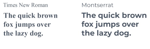
Next, think about the typeface you’d like to use to match your messaging. There are two main typefaces to choose from: serif fonts that have decorative details at the end of letter strokes, and sans-serif fonts that lack the decorative details.
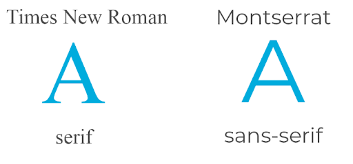
Serif fonts like Times New Roman seem traditional and bookish, while sans-serif fonts like Montserrat appear modern and informal.
-
Why not both? You can try delegating serif for the title font and sans-serif for the donation ask font, or vice-versa. Explore this font-pairing website to see font combinations in action and possibly find the font pair you want!
-
Save bold for when you need to emphasize information.
-
When in doubt, choose grayscale font colors: shades of gray that sit between white and black. Opting for grayscale colors can keep your design simple and sleek while letting accent colors stand out. Plus, there’s nothing more legible than a black font!
How to build a polished branding
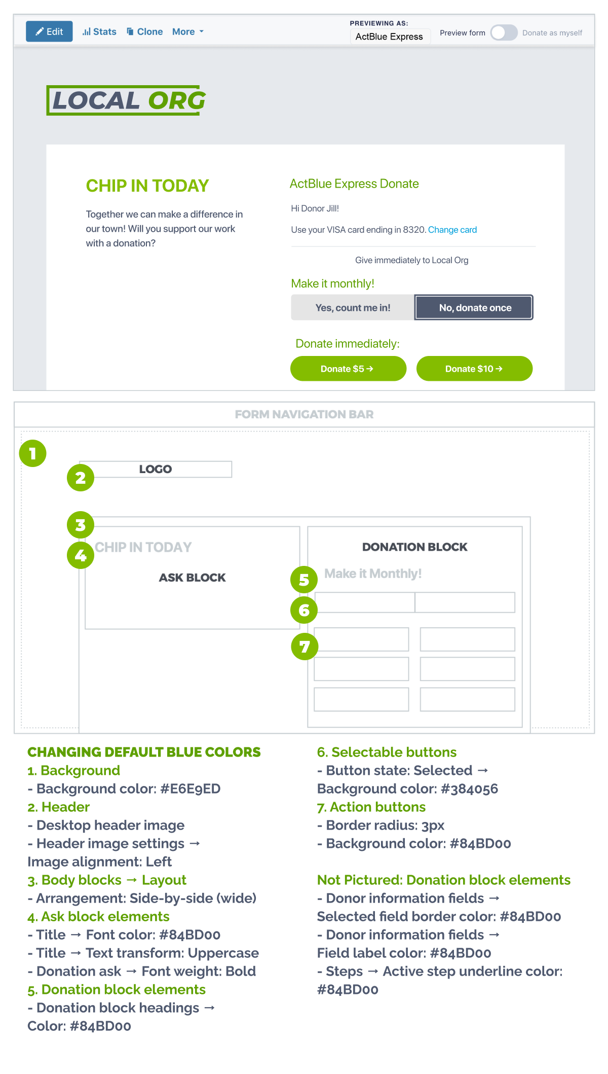
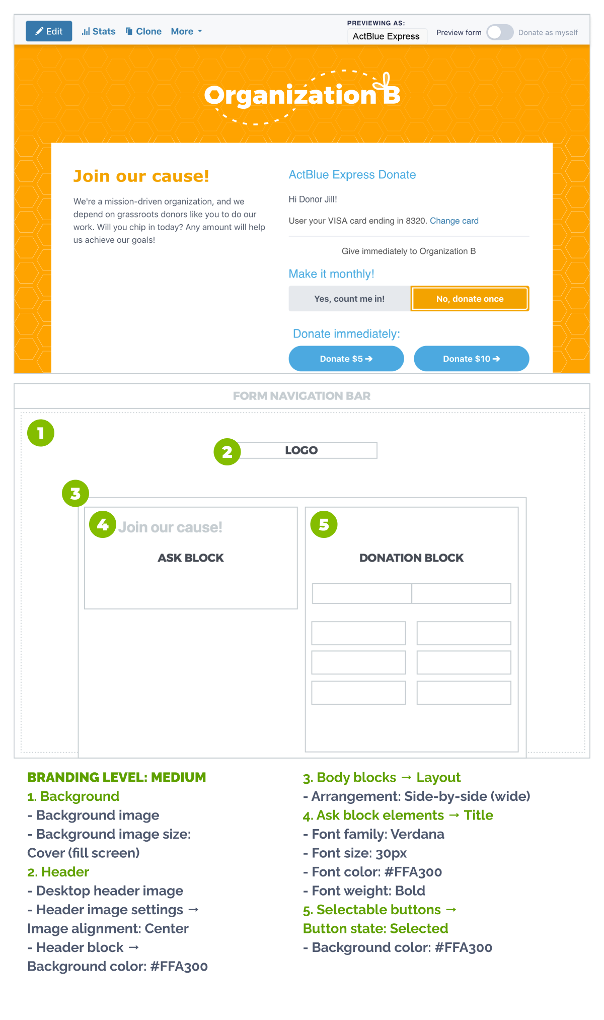
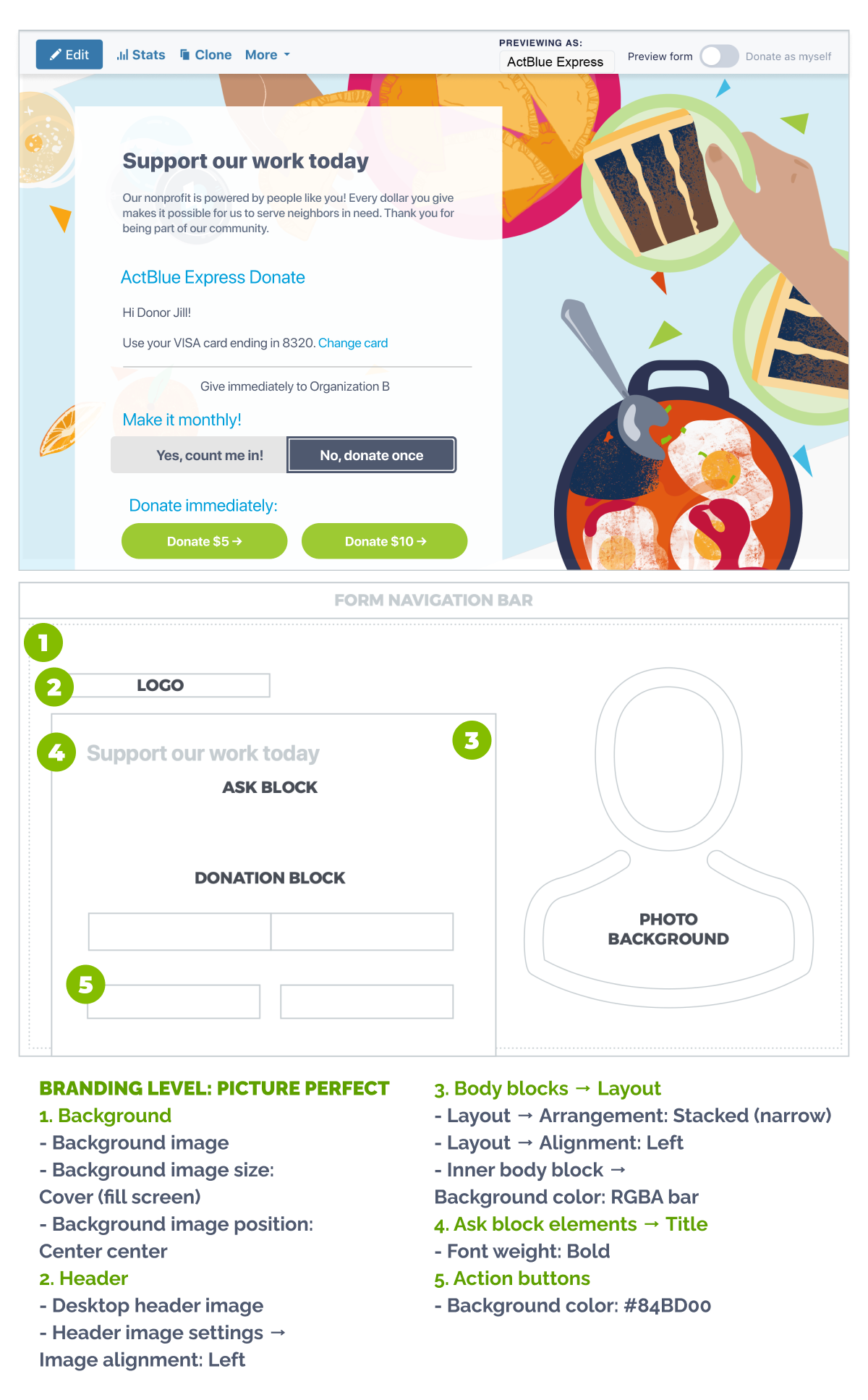
The branding editor offers many customizations, but you only need a few to create impactful brandings. Here are four branding templates that you can follow step by step, even if you’re not a graphic designer! We’ve labeled all of the elements in the branding editor that you need to use to create these designs.
Branding Level: Easy

Branding Level: Medium
Branding Level: Picture Perfect
Changing Default Blue Colors